

AppScreen Studio 3.0 Is Here
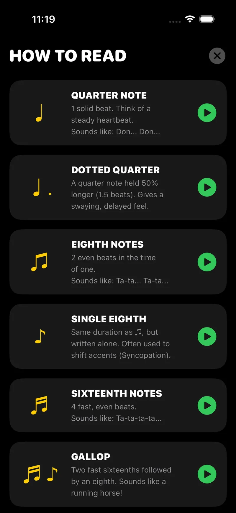
Today we’re shipping AppScreen Studio 3.0 — our biggest step forward since the original launch. This release is about one simple goal: help you ship polished work faster, with fewer clicks, less friction, and a UI that stays out of your way. Over the past months we studied how teams actually use AppScreen Studio day to day: jumping between projects, reusing the same building blocks, aligning content to a grid, and iterating on layouts until they feel “right.” 3.0 turns those real behaviors into first-class workflows.
The first thing you’ll notice is speed. The editor feels noticeably snappier when opening large projects, switching between screens, and moving through long pages. We also refined the visual hierarchy so your attention goes to what matters: content, spacing, and structure. Controls are grouped more logically, and the interface is calmer so you can focus on decisions instead of panels.
AppScreen Studio 3.0 also leans into consistency. Grid-based building is clearer and more predictable, so what you place is what you get across breakpoints. We improved how sections snap, how elements align, and how blocks behave when you reorder content. That means less manual nudging, fewer “almost aligned” moments, and a smoother handoff when multiple people touch the same project.
Finally, 3.0 is built for iteration. You can explore variations quickly, compare layouts, and tighten your page without losing the thread. Whether you’re creating a landing page, a product announcement, a portfolio, or an internal doc hub, the workflow is designed to reduce the time between an idea and a shareable link.
If you’re already using AppScreen Studio, 3.0 is available now — open the app and you’ll see the new experience immediately. If you’re new, this is the perfect moment to start: you’ll get the cleanest UI we’ve ever shipped, performance improvements everywhere, and a foundation that makes future updates even more powerful. Thanks for building with us — 3.0 is only the beginning.